Congratulations to Lindi Forand and Landry Forand, designers of our new logo!
Lindi and Landry have provided some insight into the design of our new logo:
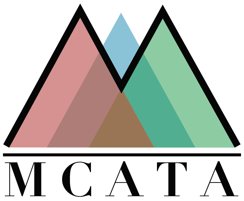
“This logo celebrates MCATA’s history and meaning by maintaining visual intersections expressing the relationship between students, curriculum and teachers. The intersecting triangles are reflective of the delta symbol representing ongoing change. Change in students as they learn and grow, teachers as lifelong learners and ongoing professional development, and curriculum as content and pedagogy adapt to the ongoing progress of learning. Each triangles change and growth are supported and developed for one another – thus the intersection at the base being the core support of one another as they reach higher.
The 3 additive primary colours are used separating each triangle and then mixed creating new colours, meanings and support. Students are celebrated in the center of the logo with blue which demonstrates how curriculum and teachers can support students to their independent success as learners.”
(Lindi and Landry)
Information about previous council logos can be found HERE
Thank you to everyone who submitted a logo!


